
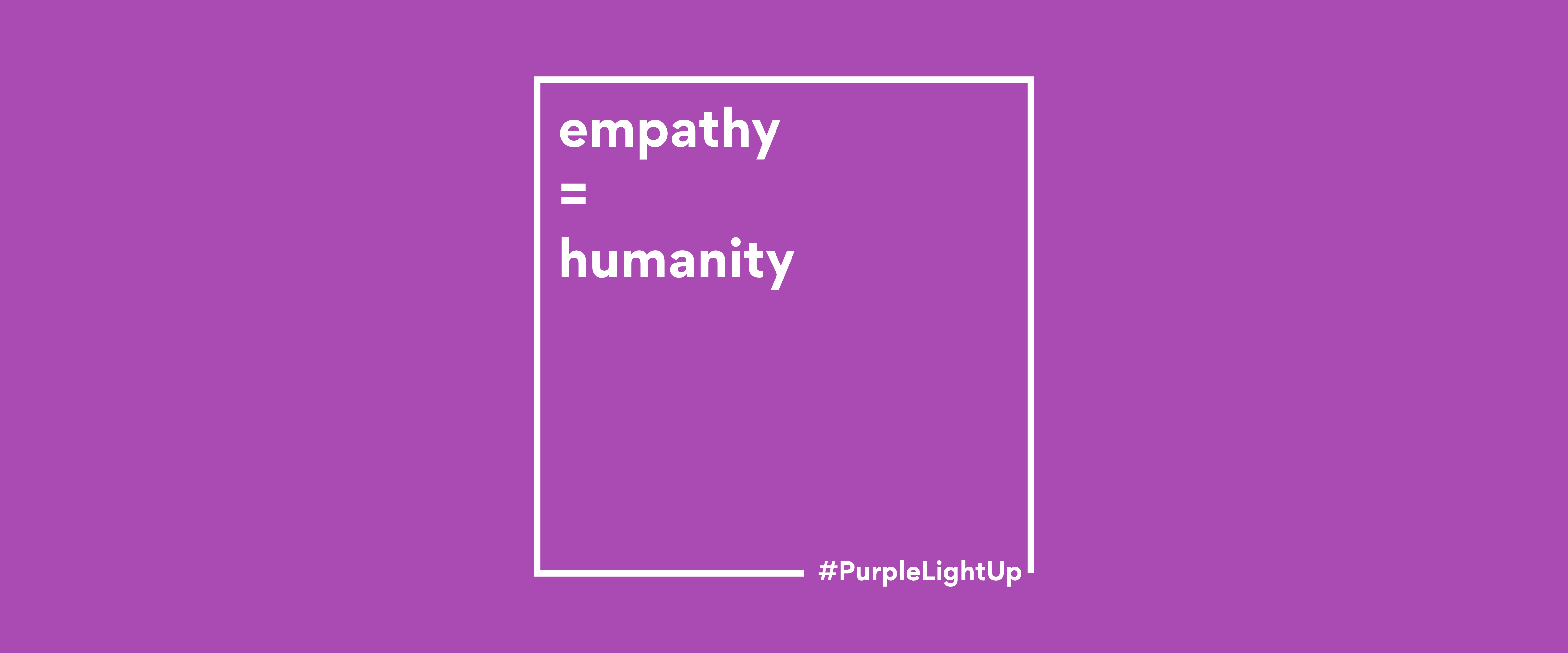
Empathy differentiates good from excellent in many regards of life. For a business and product, empaths play a big part in its success. Together with inclusivity and compassion, it is a word creators should highlight in bold. Yet often, empathy is implemented only partially or left out completely.
Accessibility is an important aspect of the work of a UX designer, business analyst, developer, and tester. However, it is hardly ever considered to be a part of a writer’s job. Consequently, the aimed inclusivity and easy usability of the product becomes a false promise. As the a copywriter for the George app, it is my mission to make the app as accessible as possible by means of words.
Accessibility: one word, many exclusions
Accessibility is the quality of being easy to use. We all are affected by the lack of it, regardless of our physical or mental restrictions. Sometimes, our exclusion is situational such as a poor internet connection or temporary like our cracked phone screen. Other times, exclusion is permanent such as a medical diagnosis.
UX writers of an app, for example, create the mobile screen reader texts for the blind and visually impaired users. It is their (and my) job to make sure those texts are clear, direct and easily understandable — given that they are read out loud at a fast pace. While it goes without saying that it is a first step of tremendous importance, the goal of making a product accessible for the blind and visually impaired is where many companies (and writers) tend to stop. Without going beyond screen reader texts. Without ever packing the standard copy with empathy, thought, and compassion, too.
It is crucial to work with a variety of possible accessibility issues and users affected by them in mind. Without attempting to generalise, here are only some of many possible users I believe should be considered when writing for (and designing) a product:
The new user
While we are busy all the time creating new ‘things’, we tend to forget what it is like to be a new user. A new user might be anxious about using a product. It is the creators’ job to give them everything they need and nothing more. Naturally, the longer you have worked on a product, or the deeper you have confronted yourself with it, the more you know about it. And hence, the further you are from the beginner’s perspective. I try to put myself in the shoes of new users more often, keep a beginner’s mind and be obvious with labels, buttons, descriptions, and the overall copy.
The distracted user
A new parent might be lacking concentration and time. Other than probably sleep, they require to be provided with the short, quick and easy information they have been looking for–without the hurdles. It is the job of many of us working on George to help users do what they came for as quickly and smoothly as possible. For UX writers and copy (as well as for UX designers and user journeys), this means: Keep it short and simple. And scratch all the unnecessary redundancy that is hiding in plain sight.
The overwhelmed user
Users with e.g. diagnosed anxiety–a nowadays common condition–may encounter a variety of struggles when using an app. They might be easily overwhelmed by many different colours and shapes, as well as by situations in which they are uncertain of how to use something. Users with anxiety tend to have a hard time deciding when there are too many options or when they are under time pressure. This is a potential user that must be crucial in the work of UX designers and UX writers. It underlines the importance for writers to get to the point fast, given that this user can find many text segments within one screen as well as excessively long texts severely stressful. Moreover, users with anxiety particularly rely on a writer’s usage of consistency. Which is why I pick certain terms, note them down in a Tone of Voice guide, and stick with them.
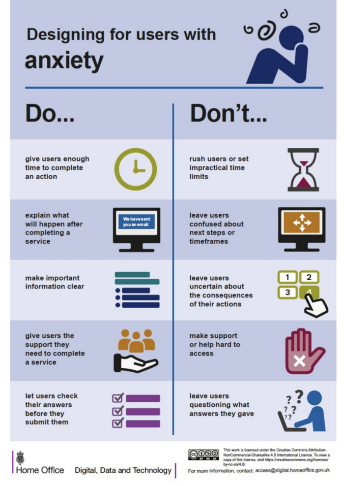
gov.uk — Anxiety Guide relevant for Designers and Writers
The literal user
Something as simple as funny phrases, word plays and puns can make a product surprisingly recognisable. In the right place, at the right time, for the right audience. However, users on the spectrum might not understand that one joke in the description and take it literally, instead. Now, if something funny also works when viewed from a literal perspective, then great. But it is my job to make as sure as I can that it won’t be perceived as confusing or insulting by users, including those with autism.
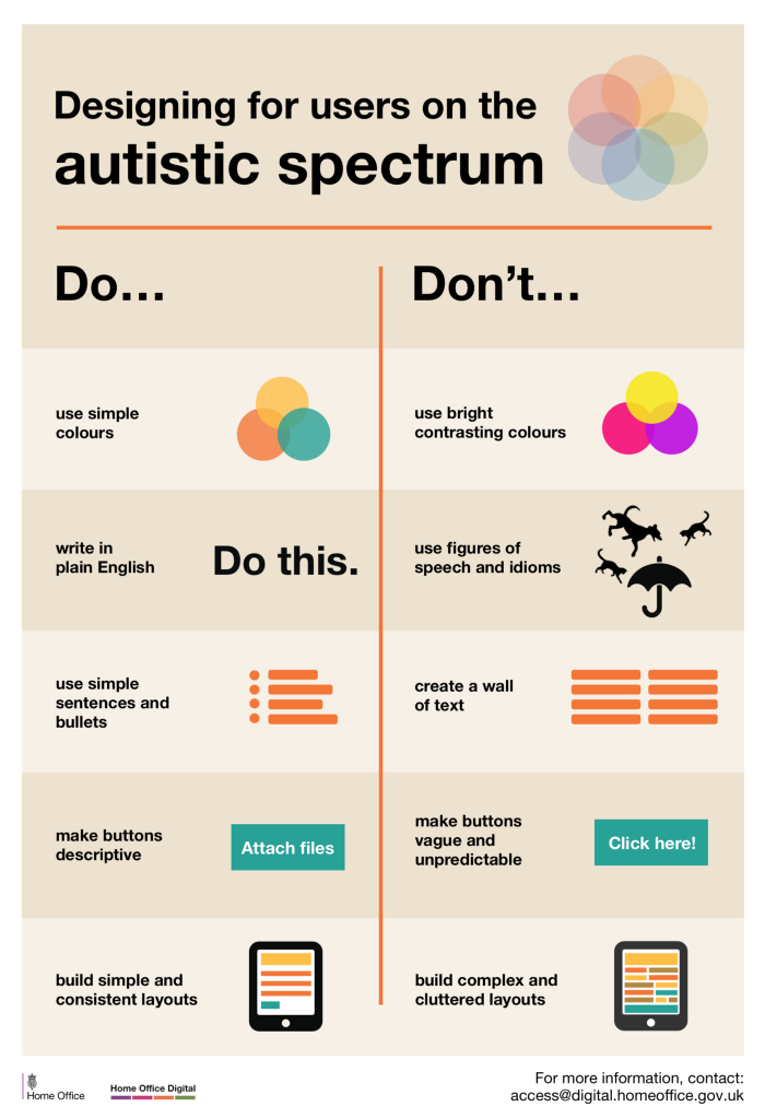
gov.uk - Autism Guide relevant for Designers and Writers
And all the users in between
More than 1 billion people in the world have some form of disability, which corresponds to about 15% of the world’s population. In addition to the 15%, the new users, parents, elderly, busy people with poor internet connection, cracked screens and a temporarily broken arm require attention as well.
Consequently, it is hard to create a platform or product which is accessible for all various needs. Yet, is it impossible? I do not believe it is. (The four different user types mentioned above have at first glance at least one common need: Less is more.) And this is why I think we should spend time and resources trying: Because no one should be excluded due to their disability. It is as simple and hard as that to consider all possible users — including their appendant temporary and permanent restrictions.
Becoming accessible
Here are 4 things I have learned to work with and am continuously reminded of to add to my writing process:
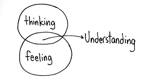
ef.com – Understanding users
- Make words accessible for all users; the users that can’t see the words AND the ones that can.
- Put yourself into other possible perspectives besides your own.
- Keep it short and simple.
“Getting to the point quickly has less to do with intelligence and more to do with time and respect.” – Sarah Richards, Content Designer
- Do not assume.
Scratch the words ‘simply’ and ‘just’ from your copy-vocabulary. Something might be easy for you to do e.g. ‘Simply click on the button below’, however, this does not mean it is easy for all users. Like Ben, who has Parkinson’s disease with tremors.
Do not assume that a joke or pun will be perceived as funny by all users.
And while we’re at it, please do not assume all users are having ‘a beautiful day’ or ‘look great’. Because that’s the last thing Karla needs, who has just received terrible news. It is also not something Frank wants to hear, who has accidentally coloured his hair purple. (Regardless of how well it suits him.)
If you have skipped to the end, here is what you have missed:
Work with empathy. And inclusivity comes knocking.
For more of Daniela’s articles, head over here.
