One of the George product principles is “banking should be simple”: George emphasizes simplicity, clarity, and reliability when it comes to all his features. There are a lot of things that we do as a team in order to achieve this and one of them is testing our ideas with real people before starting to implementing it.

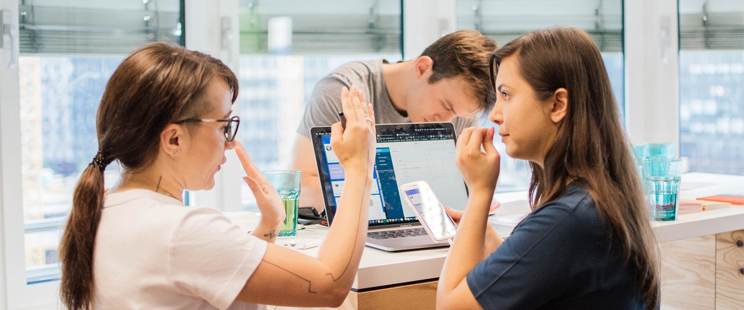
When your banking app is not that simple.
“If you are not checking you are guessing”
I like this quote from Sarah Gibbons, a Chief Designer at Nielsen Norman Group. It’s a good reminder for me that designs I create shouldn’t be based on any assumptions and I always need to test it.
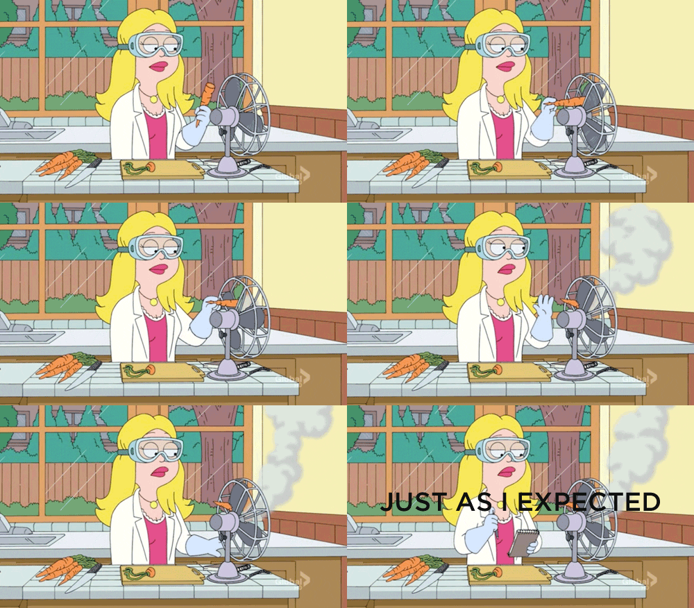
When you test a new feature.
How does it work in practice?
Recently, we, the George team joined forces with EMPATIC and hosted a usability testing event called Testessen where corporates, start-ups and developers had the opportunity to easily test their products or ideas. Pizza and beer were provided as well (of course!).
It’s a similar concept to a speed dating but in this case, your “date” is a prototype: 6 people testing 6 prototypes, during 12 minutes per testing. Probably slightly less romantic but also fun! 😄
You might ask why 6 people? Is it really enough?
“Elaborate usability tests are a waste of resources. The best results come from testing no more than 5 users and running as many small tests you can afford”

“It is widely assumed that 5 participants suffice for usability testing. In this study, 60 users were tested and random sets of 5 or more were sampled from the whole, to demonstrate the risks of using only 5 participants and the benefits of using more. Some of the randomly selected sets of 5 participants found 99% of the problems; other sets found only 55%. With 10 users, the lowest percentage of problems revealed by any one set was increased to 80%, and with 20 users, to 95%.”
We also collected a few tips from us and some of the participants as well:
- It is so important to confront your users with your ideas and prototypes as early as possible. This helps you make justified decisions in your design thinking process. And yes — sometimes your findings won’t be what you had hoped for, but hey, at the end of the day you need to make your users happy! — Vivien Ostinelli, UX Designer at bloom diagnostics.
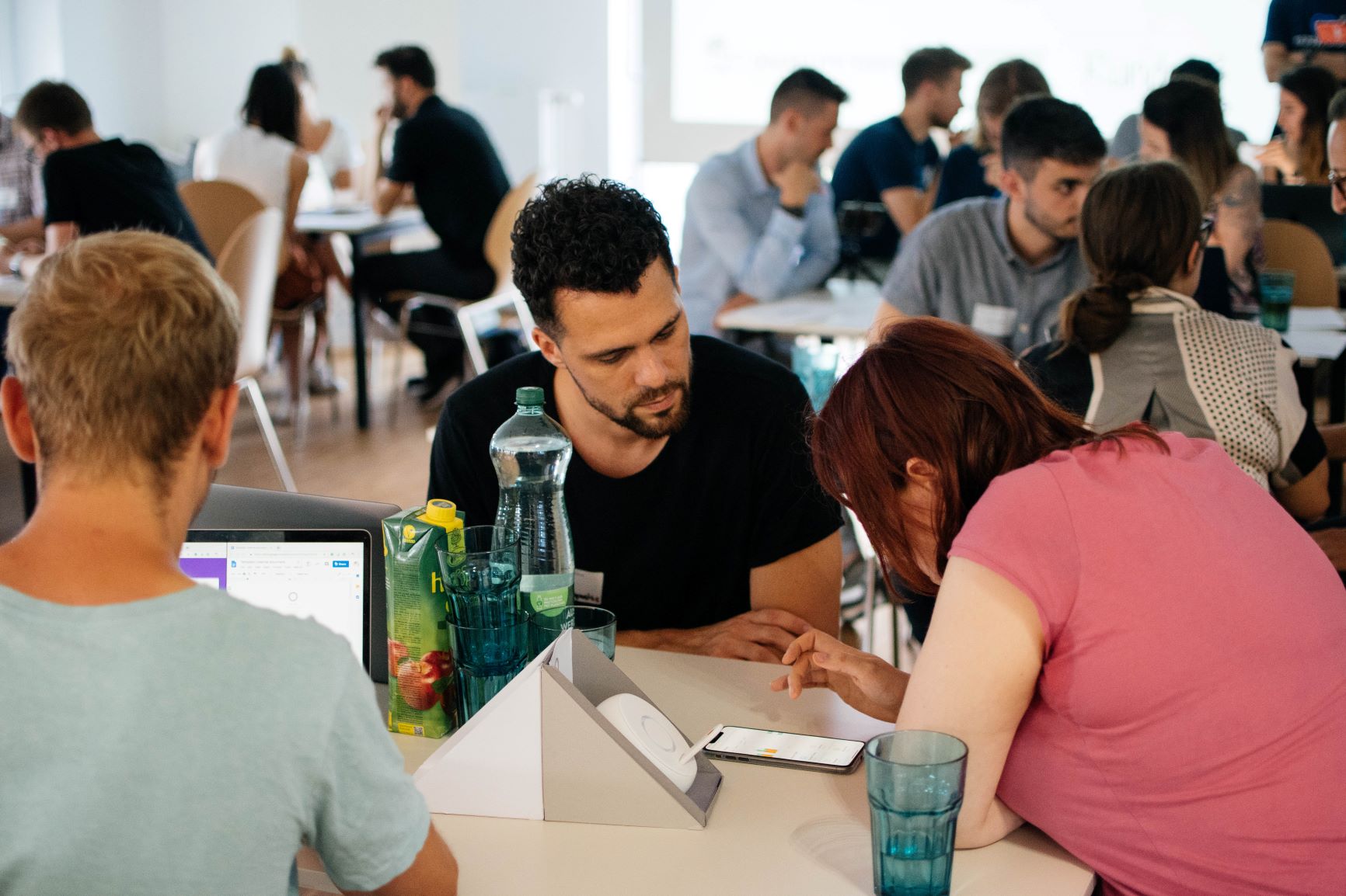
Vivien testing their new health care solution. Foto: George Labs/Albin Kurtanovic
- It’s an insightful lesson for the narrowed and biased view of your product but also kickstarts your creativity for new ideas. — Manuel Thomas Schmidt, Digital Alchemist at Darwins Lab.

Who came here for food? Foto: George Labs/Albin Kurtanovic
- Let your testers struggle and try not to over moderate. In case users ask questions to try to get your consent if they are doing it right never give them direct answers, instead, ask reverse questions like “And what are you looking for?”
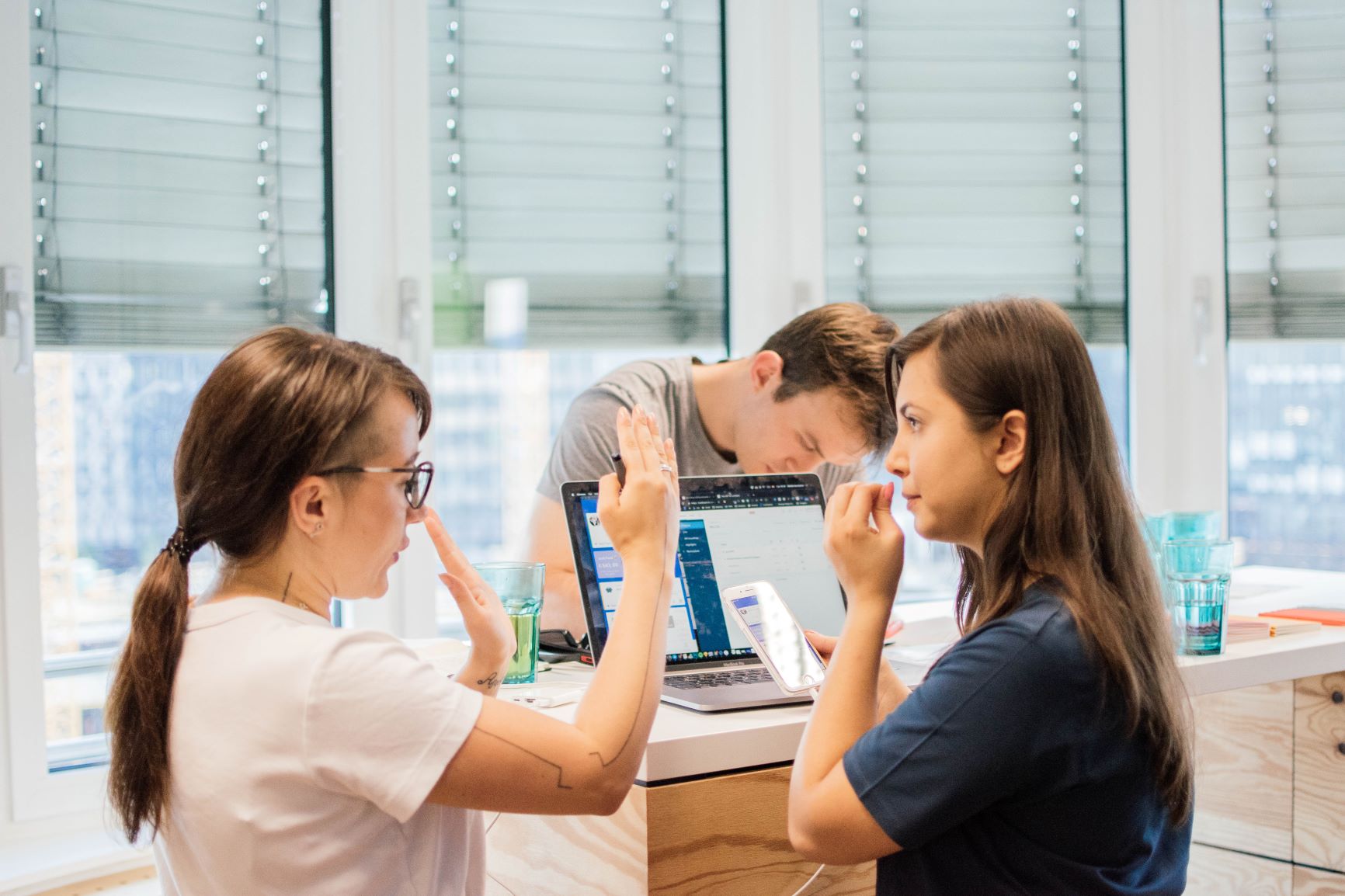
When you try to explain how big a button should be. Foto: George Labs/Albin Kurtanovic
Useful resources & tools:
- More about Usability Testessen events (relevant for Germany & Austria or if you want to bring it to your country) https://usability-testessen.org/en/
- The software we use for video recording testing sessions: lookback.io
- For creating mind maps and idea collection: miro.com
- More about usability testing: https://www.nngroup.com/articles/which-ux-research-methods/ and https://www.nngroup.com/videos/usability-testing-w-5-users-design-process/
Thank you for reading and happy testing!


